Token Cards
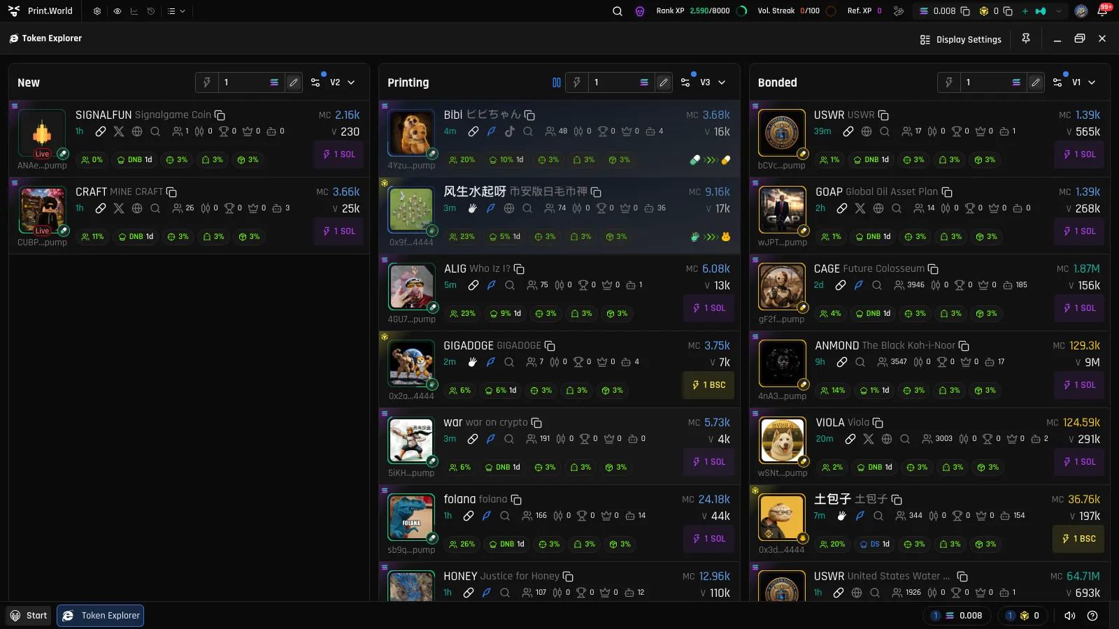
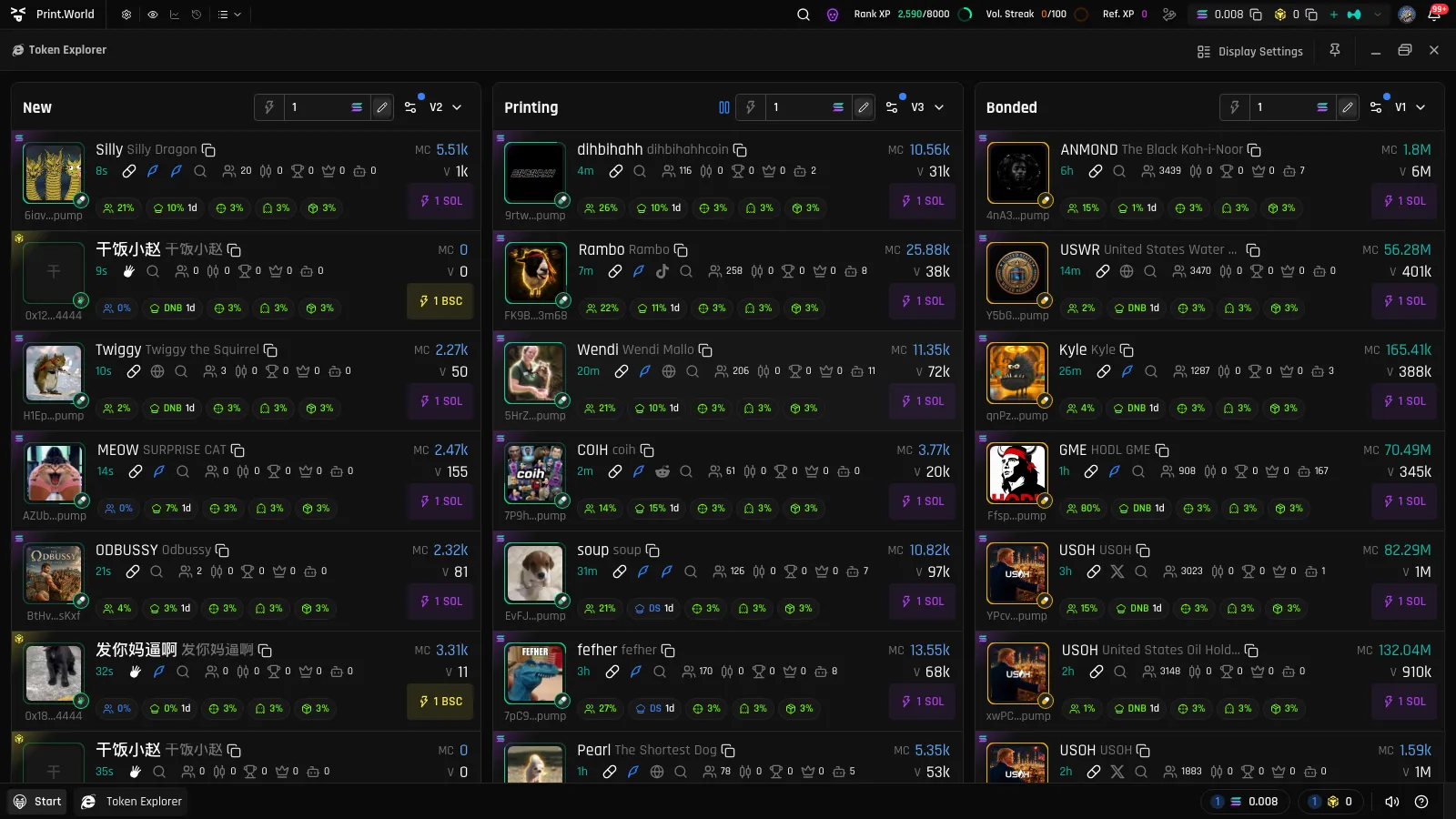
Every row in a Token Explorer list is a token card — a dense summary of every metric you need to evaluate a Solana token at a glance. This page breaks down each element.
Token Image & Badges
Section titled “Token Image & Badges”- Bonding progress ring — the ring around the token image fills as the token advances along its bonding curve. You can switch it to a linear progress bar below the image in Display Settings.
- Launchpad badge — a small icon on the corner of the image showing where the token launched. Once the token bonds, this switches to the icon of the DEX it migrated to, with a yellow ring.
- Chain indicator — a colored corner marker with the chain’s icon, showing which network the token lives on.
- Live tag — a red “Live” tag appears on the image when the token has an active live stream.
- Spam tag — a warning tag flags tokens whose creator is mass-deploying tokens (“Spam, mass token deployment by creator”).
- Contract address — the token’s mint address, shortened, displayed under the image.
Symbol, Name & Copy
Section titled “Symbol, Name & Copy”The card shows the token symbol (bold) and full name, with a copy button that copies the complete contract address to your clipboard.
If Translation is enabled in Display Settings, translated names and symbols appear in yellow alongside the originals.
Token Age
Section titled “Token Age”The token’s age appears as a relative time in teal (for example, “2m” or “3h”), counted from creation. For Bonded tokens, the card shows time since the token bonded instead.
Social & Link Row
Section titled “Social & Link Row”- Quote-pair badge — shows the token’s quote currency (for example, USDC or USD1) when it isn’t the chain’s native coin.
- DEX link — opens the token’s page on its DEX or launchpad.
- Twitter and Website — open the project’s official links.
- Twitter search — searches the token’s contract address on Twitter/X.
All of these open in a new browser tab and do not open the token page.
Stats Row
Section titled “Stats Row”- Holders — the current holder count. Clicking it opens the token page directly on the Holders tab.
- Bots — the share of bot accounts detected among the token’s traders.
Market Cap & Volume (MC & V)
Section titled “Market Cap & Volume (MC & V)”- MC — the token’s market cap.
- V — the token’s 24-hour trading volume.
Both are color-coded based on thresholds you control: you define the value ranges and the colors for “normal”, “high”, and “above” in Display Settings → Metrics. The Holders count uses the same threshold-color system. You can also choose the display size for these values, or force Market Cap & Volume to always render large.
Holding Tags
Section titled “Holding Tags”Small pill-shaped tags summarize who holds the token:
- Top holders — the percentage of supply held by the top 10 wallets.
- Dev holdings — how much the creator currently holds. The tag color reflects the developer’s status (for example, whether they sold), and a tooltip provides the details.
Vesting & Bonus Tags
Section titled “Vesting & Bonus Tags”- Vest — tokens with an active vesting schedule show a “Vest” tag with a mini progress bar. Hover it to see how much is unlocked and when the next unlock happens. Fully unlocked tokens show “Fully vested”.
- Bonus — a green glowing tag showing an amount of bonus tokens attached to the token’s reward pool.
Quick Buy Button
Section titled “Quick Buy Button”Each card ends with a Quick Buy button showing your preset amount in dollars (for example, “$25”). One click executes an instant buy for that amount at the live price — see Quick Buy for amounts, settings, and requirements. The button’s size and color are configurable in Display Settings.
Card States
Section titled “Card States”- Migrating — while a token is graduating from its curve to a DEX, the card is highlighted with an animated overlay and the Quick Buy button is temporarily hidden. Once migration completes, the token appears in the Bonded list.
- Launchpad color background — an optional setting tints each row with its launchpad’s color.
- Binder tokens — tokens launched through the Binder Protocol can show a faint version of their image as the card background (toggleable in Display Settings).