Customization
The Token Explorer is a token screener you can shape around how you trade. Display Settings controls what appears on every card, how metrics are colored, and how the lists themselves are arranged.
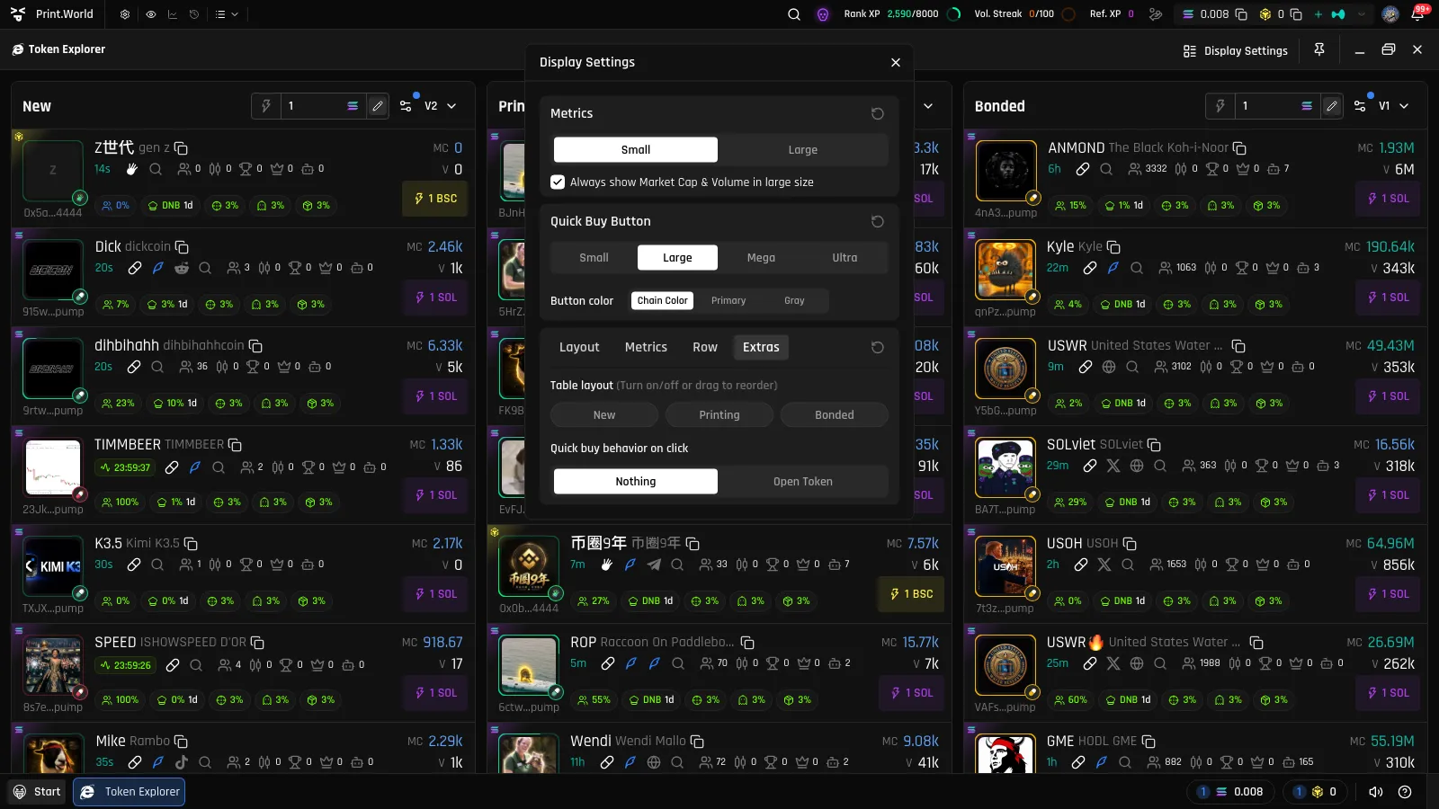
To open it: click the “Display Settings” button in the explorer’s window title bar (on mobile, tap the list-layout button in a list header to open the Display settings sheet). Changes apply live to all lists, and every section has its own reset button.
Metric Sizes
Section titled “Metric Sizes”At the top of the settings:
- Value size — render metric values small or large.
- “Always show Market Cap & Volume in large size” — keep MC and V prominent regardless of the size chosen for other values.
Quick Buy Button Style
Section titled “Quick Buy Button Style”Style the Quick Buy button on every card:
- Size — small, large, mega, or ultra.
- Color — the chain’s color, the platform’s primary color, or gray.
Layout Tab
Section titled “Layout Tab”Customize rows
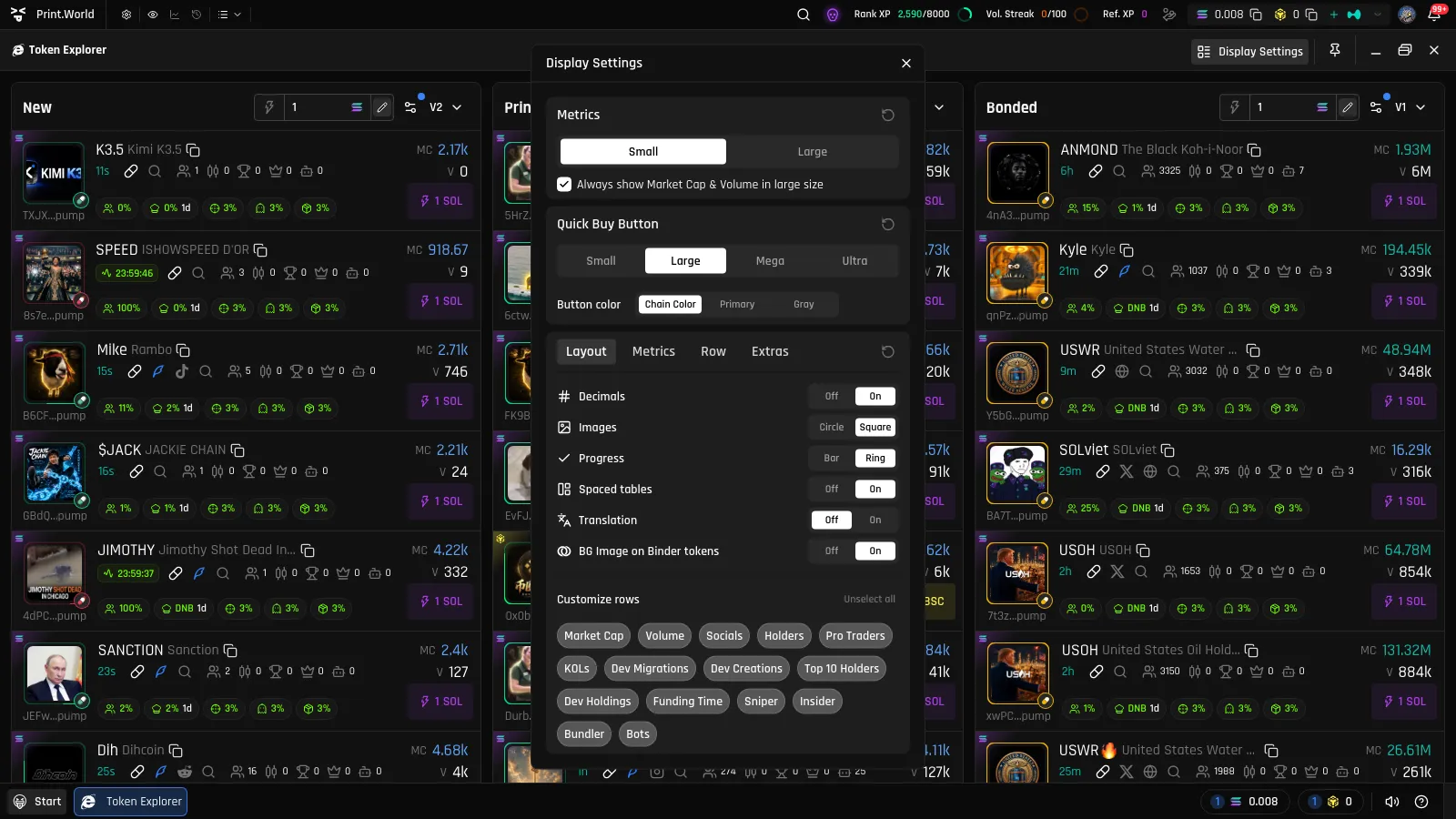
Section titled “Customize rows”Toggle each card element on or off individually — Market Cap, Volume, Socials, Holders, Top 10 Holders, Dev Holdings, Bots, Vesting, Bonus, and more. Turning rows off makes cards more compact; turning them on gives you the full data view. See Token Cards for what each element means.
Appearance options
Section titled “Appearance options”- Decimals — show or hide decimal precision on values.
- Images — token images as circles or squares.
- Progress — bonding-curve progress as a ring around the image or a bar below it.
- Spaced tables — add spacing and rounded borders between list columns, or join them edge to edge.
- Translation — show translated token names and symbols (in yellow) next to the originals.
- “BG Image on Binder tokens” — show a faint token image as the card background for Binder tokens.
Metrics Tab: Color Thresholds
Section titled “Metrics Tab: Color Thresholds”Define the color coding used for Market cap, Volume, and Holders on every card. For each metric you set two boundary values and pick three colors — one for values below the range, one inside it, and one above. This is how the MC/V colors on token cards get their meaning.
Row Tab
Section titled “Row Tab”- Launchpad color background — tint each card’s background with its launchpad’s color, making it easy to spot where tokens launched while scanning the list.
Extras Tab
Section titled “Extras Tab”- “Table layout (Turn on/off or drag to reorder)” — enable or disable each of the New / Printing / Bonded lists and drag them into your preferred order. Disabled lists disappear from the explorer entirely.
- “Quick buy behavior on click” — choose what happens after a Quick Buy: nothing (stay in the list) or open token (also open the token’s page).